The Data
Twelve months’ worth of demo sales data over 2 years. Bit of data cleaning required. With only 12 months of data, I decided to do a monthly sales dashboard. I had seen widgets on a demo dashboard not built with Power BI and I wanted to see what it would take to create something similar with Power BI.
The Report
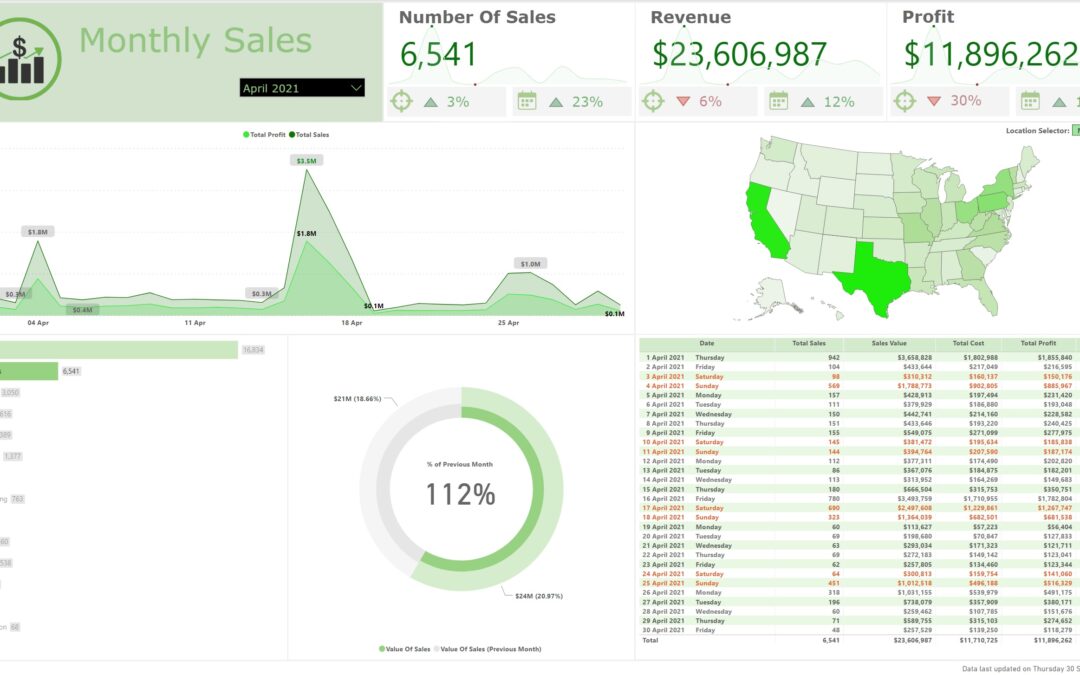
The widgets function by displaying their values (total sales, Profit etc.). It also includes a line chart showing the same value for each month over the full year of dataset. The target and previous period percentages are also included. All these numbers and visuals are dynamic and sliceable by anything other than a date within the month. For example, the daily line chart and table will not affect the widgets, this is by design.
The widgets design is intricate consisting of 36 Items, in 9 groups, of which 18 of the items have conditional formatting options set. The items are 12 Table Visuals, 9 Shapes, 6 Images, and 3 Card Visuals, Line Charts, and Text Boxes. Also 24 measures are used in their creation.
There is a State (region) selector that can be either a map if you know where the states are located within the USA, or you can click the ‘Name’ button to have the states named listed for selection, within this option is a non-selectable, display only mini map. There are a few layers here and some bookmarks and buttons to get this effect.
Check out the live version Here
Very interesting